Wintrust Banking
Wintrust is a medium-sized financial holding company in the United States that operates 15 chartered community banks in northern Illinois and southern Wisconsin. They pride themselves in serving their community and building relationships with their clients in order to offer the best banking products and service.
Role:
UX/UI Designer
Duration:
2 weeks (October 2022)
PROBLEM
Wintrust has been working for years to provide financial literacy to customers as they promote long term habits with money that will benefit customers and their families. These customers need a way to be able to access resources and information that will help them reach their financial goals.
SOLUTION
Check your bank account balance

Browse resources curated by Wintrust

Schedule an appointment with a trusted financial advisor

Start a savings plan through the budgeting tools
MONEY TALK
Our team started off with interviewing 8 individuals from the ages of 18-64 to get a deeper understanding of their journey with their bank accounts. Where do they learn about finances? How do they save money? Here's what they said:
"I learned a lot about investing through conversations with friends."
"I wish the bank had more information on their app. I don't really use their website."
"I get emails from my bank, but I don't read them. They don't feel helpful to my own goals."
INSIGHT
01
People turn to trusted figures to learn about finances.
02
Resources are hard to find and navigate through in their banking app.
03
People have financial goals, but they're not sure how to start planning for them.
OPPORTUNITY
01
How might we ensure reliable professional guidance to customers?
02
How might we make resources more visible, accessible, and easier to navigate?
ANALYZING THE COMPETITION
Without having a bank account with Wintrust, we weren't able to access their current product. Our team wanted to scope out competitor banking apps to discover how they were approaching financial literacy with their clients.


These companies offered the necessities of any banking app such as checking your balances, opening a new account, transferring money, even starting new budgeting goals. We liked the organization and layouts, but when it came to educating their customers, they were lacking in resources available through their app.
THE USER JOURNEY
We created a user journey based off our persona, Winnie, to better understand where pain points may occur in a users lifetime, revealing where there could be business opportunities.

Click on image to expand
DESIGN OPPORTUNITY #1
How might we ensure reliable and professional guidance to customers?

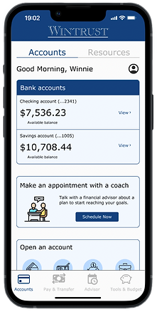
Creating an area for scheduling an appointment with a trusted financial advisor, specific to the customer's needs. Making it within the app allows for easy scheduling for users as well as allowing banking staff to focus on in-house tasks.
DESIGN OPPORTUNITY #2
How might we make resources more visible, accessible, and easier to navigate?

A separate tab for users to access a plethora of resources posted by Wintrust. Customers can search for specific topics or read/watch popular articles/videos.

A place for budgeting tools to live within the navigation. There are options to analyze spending habits, start a savings plan for any future goals. We also decided to include a button to start a savings plan within the home page.
USER FEEDBACK
We observed 6 participants in a moderated usability study with 3 tasks which were all done successfully. We got useful feedback from those meetings to incorporate into our next design.

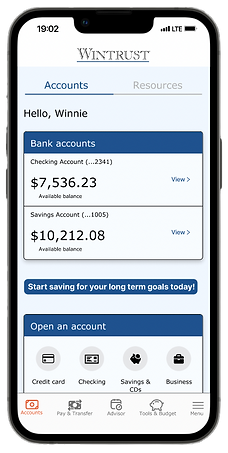
This call-to-action did not register with users. We did not make it recognizable as a button that can be tapped.


Users found the media filter confusing. We ended up removing this to simplify the flow.
REDESIGNING THE MVP
After analyzing the results of the usability studies, I kept that in mind and redesigned the app to look more modern. Here's what I changed:
-
Searching for resources is now more simple with the new organization of media types
-
Horizontal scrolling gallery to reduce amount of vertical scrolling and increase visibility of resources


-
Replaced the standalone button to have a card with a more noticeable call-to-action
-
Replaced the scheduling with a calendar instead of a drop down so users can see what days are available and unavailable
IMPROVEMENTS
We had a large amount of users to account for since having a bank account is a lifelong occurrence. Due to time constraints, our team mainly interviewed family and friends around us leaving the age range of our user research limited to people in their 20-30s. If I had more time and resources to interview anyone, I would want to increase that age range and create multiple personas. This would help us understand the journey's of various age groups, creating more accessible and inclusive designs.
FINAL THOUGHTS
Financial literacy isn't something that everyone learns in school. It takes time, resources, and practice to help deepen the understanding of the subject. Being given the opportunity to brainstorm different ways to promote financial literacy was a challenging but rewarding project. Creating a banking app that has the basic functions and needs, as well as multiple pages with learning materials and contacting possibilities showed me how valuable design workshops and communication are throughout the whole process. Though there is room for improvement, I am pleased with the minimum viable product (MVP) we created.