

Transparent Path | ProofScore
Transparent Path is a Seattle-based tech startup with a product that provides supply chain visibility, using sensors, for the shipment of perishable goods, such as food and pharmaceuticals. They created an algorithm, ProofScore, that allows producers to upload certifications, audit findings, and other relevant information on how the food is created. The more “proof” (data) a producer can offer, the higher the ProofScore they are given.
Type:
Mobile Web Design
Role:
UX/UI Designer
Duration:
3 weeks
The Challenge
Because of the lack of data within most food supply chains, consumers have little information about the food they purchase beyond the expiration date. Transparent Path’s ProofScore is looking for a way to display this information to all grocery shoppers so they know more about the food they're buying.


WHAT WE STARTED WITH
Transparent Path had worked with another group of UX designers who had done extensive research to figure out what consumers thought was important when it came to their food. My team and I sorted through reports to find the highlights of their discovery.
Shoppers Care About:

Food Safety
What is safe to eat?
What is not safe to eat?

Tamper Alerts
Was the produce damaged in any way during transportation?

Dates of Harvest
What is the freshness of the product?

Food Certifications
Os the food fair trade? Organic?

Product Origin
Is it a family owned or industrial farm? Local or overseas?

Storage Information
Was the produce in the appropriate environment during transportation?
UNDERSTANDING BOTH SIDES
After digging deep into the previous research and a great kickoff meeting with the Transparent Path team, we got a deeper understanding of what the current problem is for the business and its consumers.
Business Problem
Transparent Path:
Transparent Path believes having complete transparency with consumers and providing information about the supply chain will reduce food waste, risk and distrust. There are currently no platforms that offer this and they want to be the first.
The Users:
Consumers need a way to easily learn about the safety, sourcing, and sustainability of their groceries while shopping to make informed purchases that align with their principles.
User Problem
DESIGN OPPORTUNITIES
1
How can we create an accessible platform for all grocery shoppers to learn more about how the food they consume has been sourced?
2
How can we empower consmuers to make purchases based on the ethics and values that are most important to them?
3
How might we display the ProofScore rating in an accessible and easy to understand way?
BEFORE DESIGNING... FIND THE TRENDS
There were no other digital products that offer the same service that ProofScore does. Our team decided to find some apps and websites that have the same concept of scoring to understand best practices.
We compared seven companies to see what approach they took when it came to their score. These are a few of the results and common features we found:


-
Color scale visuals (red, yellow, green)
-
Number rating (1-10)
-
Explanation of score


-
Color scale visuals (red, yellow, green)
-
Number rating (1-100)
-
Breakdown and explains score, educational descriptions of nutrition


-
Number rating (1-5, 1-10, 1-100)
-
Explanation of score, educational approach describing the environment
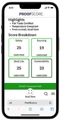
BREAKING DOWN THE SCORE
Knowing what people valued the most regarding their food as well as factoring in the findings we got from our competitive audit, we broke down the score into 4 categories:

Safety
The item’s temperature during transport and a lack of recalls or outbreaks along the supply chain

Shelf Life
How long this item will last after you take it home

Sustainability
The practices used by the farmers and transportation companies when getting their food to you

Sourcing
Where your food comes from and how it gets to you
DESIRABILITY STUDIES
After a design session sketching different pages of the website and ways to display a vast amount of information of different products, we made them digital. Then, we conducted our own desirability study to see how users reacted to different options.
Home Screen
This is the screen users would see if they came to ProofScore through a search engine.

Cards
vs

List
Users preferred cards saying it generally looked more modern and accessible.
Preferences
This page allows users to set their preferences to weigh the score in a way that aligns more with their values.

vs
Scale

Toggles
Users preferred the scale saying it was more intuitive and easy to convey information.
Score Display
This would appear on the product page after a shopper scans a ProofScore QR code.

Option 1

Option 2

Option 3
Users desired Option 2, saying it was easy to understand and more visually appealing.
USABILITY TESTING
At this point, we had our design ready to test with user tasks in mind. We administered 9 usability tests and here was the feedback we got:
Moderated Studies

The log in/sign up call-to-action was not visible enough

Turned it into a button for clarity

Floating universal navigation was confusing


Added text to "scan item", fixed navigation bar to the tried-and-true hamburger menu for recognition

The “+” symbol as a signifier to expand the cards to read more information on that score breakdown was not clear
Changed to “learn more” for more accessible language
Unmoderated Studies
After our changes following the moderated studies, we conducted another usability test with the same tasks to 32 participants. This is the feedback we got from our second round:
-
Users wanted both “log in” and “sign up” on the home page for visibility
-
Users suggested changing “Values” to “My values” to make it more personable
-
Swiping through the score breakdown cards was confusing to users because there were no indicators.


NEXT STEPS
Accessibility
Things we considered when it came to accessibility was keeping the navigation at the bottom to be within thumb's reach, making it a website so it's more approachable for most phones and people wouldn't have to download another app, and simplifying the language so it's easier to understand for users (this is an industry with lots of jargon).
More features that could be added is a colorblind version for the scoring (red, yellow, and green aren't friendly colors for all), including different languages, and speech-to-text.
More Features
There were lots of suggestions that ProofScore could incorporate into their website. Features such as notifications if your food is about to expire, adding educational articles, comparing the ProofScore of different items, a "tips & tricks" section, and so on. This product has lots of potential and areas where these could be added.
REFLECTION
Grocery shoppers want products that align with their values. Our team created a product that showed what users would want to see in a dynamic way, as well as allowing them to personalize the weight of the score to match what is important to them. Being able to condense a vast amount of information while accomplishing the goals of the business and its users to provide transparent information on produce was a challenge, but a fun one.
This project broadened my understanding of the UX process. Working off previous research was something different to me, and it was something I got to navigate through and learn from. Each person on the team had different roles and I was excited to be one of the lead visual designers. I enjoyed having the time to experiment and test multiple iterations of the product. We kept consistent communication within our team and the clients about the direction we were going and they were thrilled with the outcome.